

NNI Construction
Premium Design Package
2025
I developed a comprehensive brand identity system for NNI Construction that reflects their unique position in the construction industry. As a nationwide construction partner, they needed an identity that would communicate both their broad reach and precise local execution. The challenge was to create a visual language that would resonate with franchise businesses looking to scale their physical presence across multiple locations.
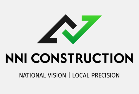
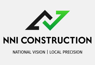
The logo design achieves visual impact through geometric simplicity. Starting with a single bold shape, I created the mark by duplicating and rotating it to form two key elements: one suggests an architectural structure, while the other creates a checkmark. When combined, these shapes reveal an "N" in the negative space between them. This straightforward approach results in a powerful symbol that represents both construction expertise and project verification in one clean mark.
Font & Color
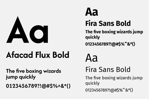
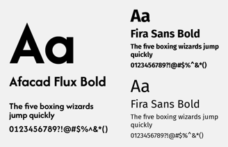
The typographic system was carefully crafted to stand apart from traditional construction industry conventions. I selected Afacad Flux as the primary typeface for its geometric precision and contemporary feel, creating immediate visual impact in headlines and key messaging. This is balanced by the highly legible Fira Sans for body text, ensuring clear communication across all brand touchpoints.
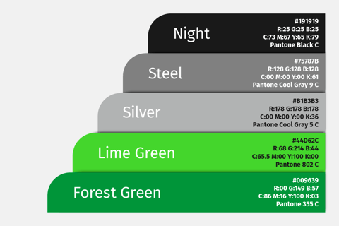
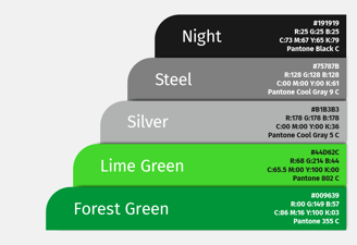
The color palette tells the story of growth and precision through a strategic combination of vibrant greens and sophisticated neutrals. The signature lime green gradient brings energy and innovation to the forefront, while deep forest green anchors the palette with a sense of stability. These are complemented by carefully selected neutral tones that provide the versatility needed for various applications while maintaining a premium feel.
Branded Assets
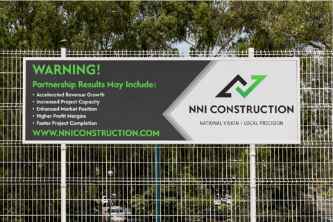
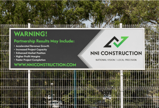
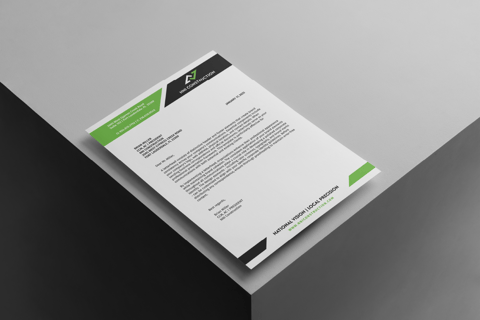
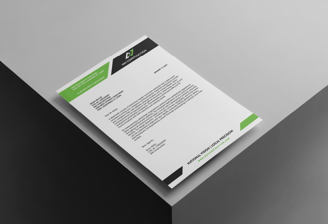
The brand identity system demonstrates its strength through thoughtful application across key business materials. The letterhead design balances professionalism with visual impact, using strategic touches of the vibrant green and diagonal accents against clean white space.
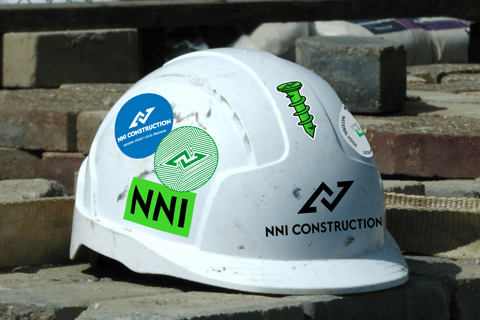
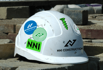
On construction sites, hard hat stickers showcase different variations of the mark – from the full logotype to the standalone N-mark – proving how the system adapts while maintaining brand recognition. This practical approach ensures NNI presents a consistent, professional image whether viewed on a business proposal or at a construction site.
Through this identity system, NNI Construction now has the visual tools to effectively communicate their unique value proposition: combining national reach with local precision in construction management.
Testimonial
Still waiting for NNI's testimonial!