
The Colour Bar: Complete Brand Identity for Hair Salon
The Colour Bar: Complete Brand Identity for Hair Salon
Brand Identity Project | 2024
Brand Identity Project | 2024
The Brief
Mickala, an experienced hair stylist, approached me to create a premium brand identity for her new salon, The Colour Bar. After years of renting space, she was opening her own location directly across from her previous workplace. This required a sophisticated identity that would differentiate her business and attract her ideal clientele away from the competition.
Mickala, an experienced hair stylist, approached me to create a premium brand identity for her new salon, The Colour Bar. After years of renting space, she was opening her own location directly across from her previous workplace. This required a sophisticated identity that would differentiate her business and attract her ideal clientele away from the competition.
The Challenge
The Colour Bar brand needed to establish an immediate sense of luxury that would set it apart from nearby competition. We needed to design an identity that would resonate with discerning women who invest in premium haircare experiences. The brand had to work cohesively across the physical salon space, service menus, website, and social media.
The Colour Bar brand needed to establish an immediate sense of luxury that would set it apart from nearby competition. We needed to design an identity that would resonate with discerning women who invest in premium haircare experiences. The brand had to work cohesively across the physical salon space, service menus, website, and social media.
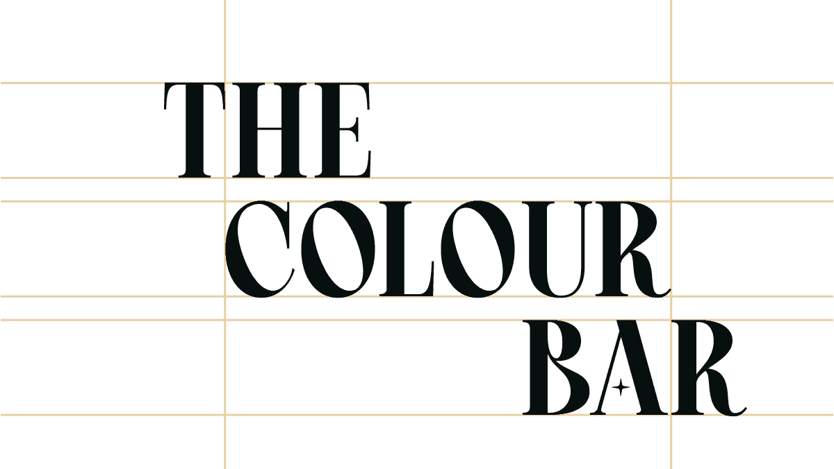
The Logo
I developed a refined logo that balances classic elegance with contemporary style to position The Colour Bar as a premium destination. The design uses sophisticated letterforms that echo high-end fashion houses like Dior and Tiffany. A monogram variation provides versatility for different applications while maintaining recognition across all touchpoints from storefront signage to social media.
I developed a refined logo that balances classic elegance with contemporary style to position The Colour Bar as a premium destination. The design uses sophisticated letterforms that echo high-end fashion houses like Dior and Tiffany. A monogram variation provides versatility for different applications while maintaining recognition across all touchpoints from storefront signage to social media.
The Process
I began by researching premium salon brands to understand visual cues that signal sophistication. Mickala initially wanted a hair color brush incorporated into the logo – a common request in the salon industry. Rather than following this predictable approach, I suggested focusing on a more distinctive solution. We developed a refined brush stroke that forms a subtle "C" for "Colour" that also resembles an eclipse. This is significant because the salon's opening coincided with the April 2024 solar eclipse in Cleveland. This connection added depth to the brand while avoiding industry clichés like scissors and combs that saturate the market.

The Typography
The typography breaks from construction industry norms while maintaining professionalism. Afacad Flux serves as the primary typeface, chosen for its geometric precision and contemporary feel for headlines. Fira Sans provides high legibility for body text. Together, they create a clear hierarchy across all brand applications.
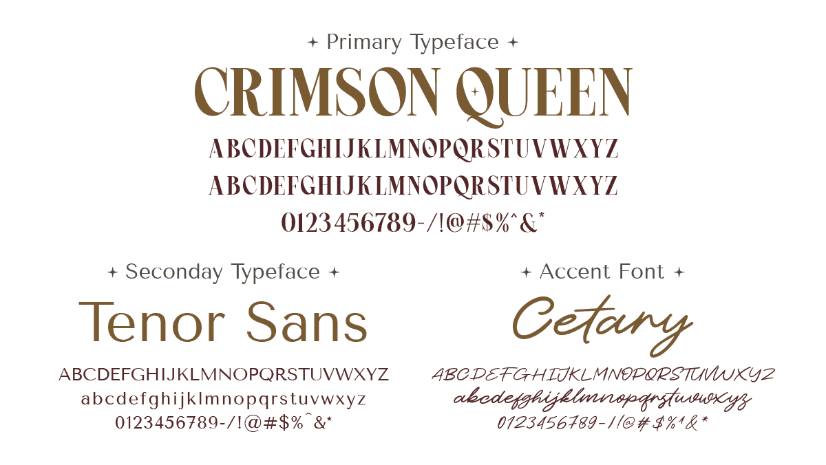
The Typography
Crimson Queen, a neoclassical serif typeface, serves as the primary font with subtle curves placing The Colour Bar in the visual company of luxury brands while maintaining an approachable personality. This font choice echoes the refined character of established high-end brands while differentiating from typical salon typography, reinforcing the premium positioning at every touchpoint.
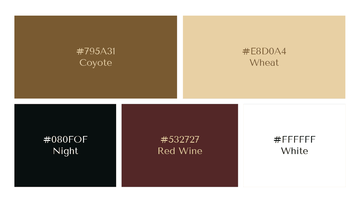
The Color Palette
The color palette combines White, Wheat, and Coyote to create a warm atmosphere that conveys natural luxury. We incorporated a muted burgundy (Caput Mortuum) as an accent that references the complimentary wine service offered to clients. The palette intentionally avoids harsh blacks in favor of softer neutrals that maintain brightness and sophistication throughout the salon experience.
The color palette combines White, Wheat, and Coyote to create a warm atmosphere that conveys natural luxury. We incorporated a muted burgundy (Caput Mortuum) as an accent that references the complimentary wine service offered to clients. The palette intentionally avoids harsh blacks in favor of softer neutrals that maintain brightness and sophistication throughout the salon experience.
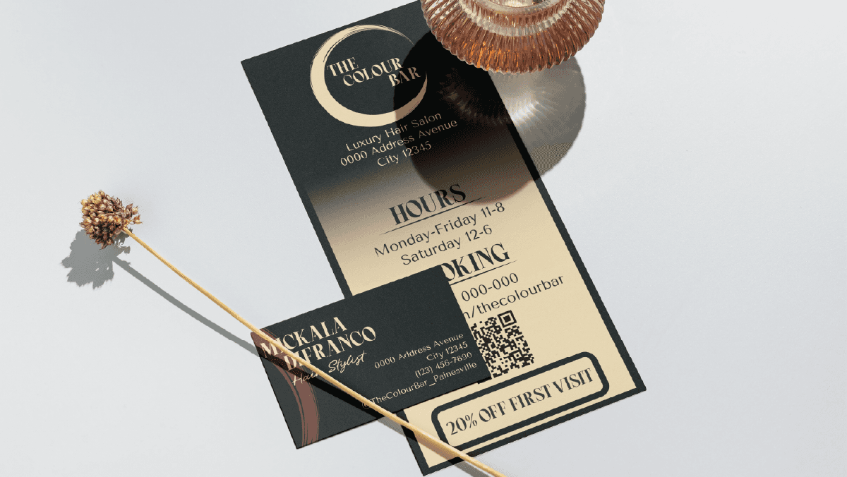
Brand in Action
A collection of branded assets and mockups.

Building Signage
Service Menu Design
Service Menu Design
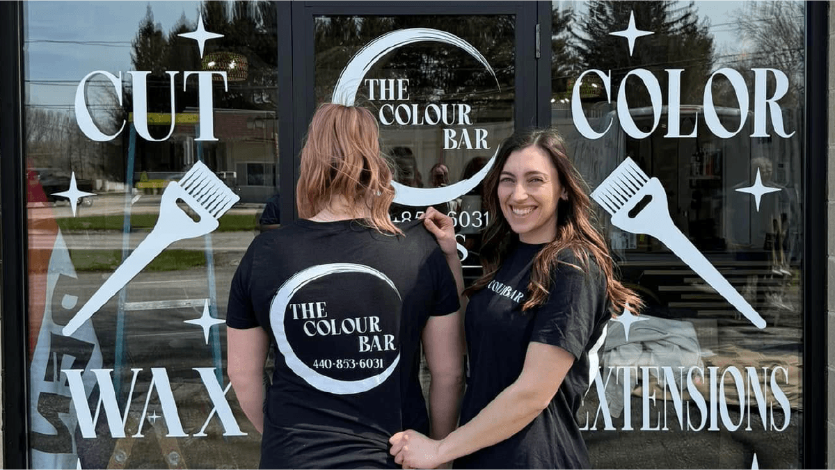
Window Graphics & Apparel
Window Graphics & Apparel

Business Card Design
Project Outcome
Project Outcome
The completed Colour Bar branding successfully established Mickala's salon as a premium destination distinct from her previous workplace. The sophisticated identity helped justify higher service pricing while attracting clients who value luxury experiences. Within three months, Mickala had retained her previous client base while attracting new customers drawn to the salon's elevated positioning. Most importantly, the brand gave her the foundation to build her independent business with confidence directly across from her former employer.
The completed Colour Bar branding successfully established Mickala's salon as a premium destination distinct from her previous workplace. The sophisticated identity helped justify higher service pricing while attracting clients who value luxury experiences. Within three months, Mickala had retained her previous client base while attracting new customers drawn to the salon's elevated positioning. Most importantly, the brand gave her the foundation to build her independent business with confidence directly across from her former employer.